With the first stock market correction in over a year, having occurred in early February, there were many media narratives about what caused the selloff. We think it was driven by the unwind of the short VIX trade. Buying protection wasn’t considered important with the VIX at record lows in 2017. However, when nobody thinks there’s a need for protection, it’s probably a good idea to buy some especially since it’s cheap. Shorting the VIX is shorting protection. The stock market was like a car driving 80 miles per hour where the riders were betting against the need for air bags. The tail wagged the dog as the derivatives market moved stocks instead of the reverse.
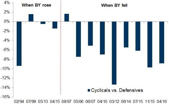
For some reason, the 10 year bond yield got blamed for the selloff even though it had been increasing for months beforehand while stocks rallied. Furthermore, when the selling occurred, yields actually fell and then they rose after the correction ended. Some analysis implies the 10 year bond yield needs to hit 3.5% to affect stocks and other analysis shows stocks rally with every 100 basis point movement higher in bond yields. The chart below supports the latter point.
The chart above shows past examples of corrections in the stock market, broken down between when bond yields (BY) rose and when they fell. When yields fell, defensive stocks outperformed and when bond yields rose it was more mixed. This suggests that bond yields are correlated to economic growth. When growth expectations are falling, defensive stocks outperform, which isn’t necessarily great because the overall market is usually under performing or declining.
Inflation Curve Flattening
The yield curve is the best cycle timing measurement. While it’s tough for metrics to remain consistent in a rapidly changing world, the yield curve has remained accurate in this business cycle. By remaining normal, the yield curve has correctly suggested the expansion will continue. The numerous corrections in the flattening trend have prevented an inversion. Many investment banks are calling for a recession sometime between 2019 and 2021 because, if the trend continues, it looks like an inversion will occur in the next 12 months. They assume the flattening will continue and that the recession will occur about 1-2 years after the inversion. It’s a possibility, but far from certainty.
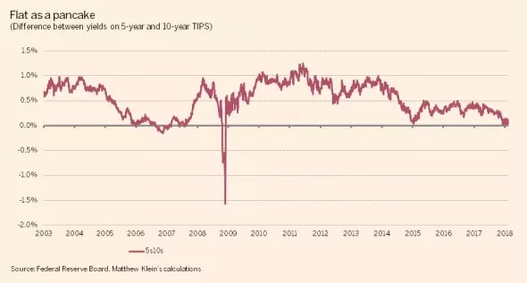
The chart below shows a different term premium.
The chart shows the difference between the 5 year yield and 10 year yield on TIPS bonds. The inflation estimates have flattened meaning investors aren’t expecting much more inflation over 10 years than over 5 years. In the past 15 years, this relationship has had a decent economic forecasting track record. It inverted from late 2006 to early 2007 and the economy fell into a recession in late 2007. The difference flattened in early 2015 and the economy was very weak in 2016. The latest flattening could be bad news for growth in the next 12 months.
We wouldn’t go as far as to assume a recession is coming soon, but this indicates the current inflation rate in the intermediate term will probably be as high as it gets this cycle. That’s reasonable because the effect of the fiscal stimulus on inflation could wear off. Usually inflation leads to a recession, so if it increases decently in the next 12-24 months, a recession along with lower inflation would follow.
US Stock Market Most Expensive In The World
One of the reasons investors were quick to blame the higher 10 year bond yield for the recent selloff was because they believe the low interest rates are justifying high valuations. Value investors have been concerned about high valuations for a few years. The concern has lasted so long that some momentum traders openly mock value investors for missing out on the gains seen in the hottest stocks. According to the Shiller PE, the US stock market is the most expensive of the major global equity markets. While predicting if and when the stock market’s valuation will come in line with historical averages is tough, the solution to this problem isn’t that difficult. Simply go overweight foreign developed equity markets and emerging markets to avoid potential long term US underperformance because of the high multiple on the US stock market.
U.S. Stocks Have The Best Real Historical Performance
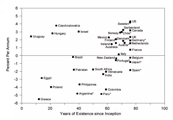
Besides currently being the most expensive market, the US market has another global distinction. As you can see from the chart below, the U.S. stock market has the best real average annual returns from 1921 to 1996.
If you have a global viewpoint, when retail investors and passive investing firms say stocks always move up, you should cringe. It’s naïve to say stocks always move up just because US stocks have a great track record. Some contrarian investors would feel inclined to fade that trade because the consensus wisdom is only based on past action and past results far from guarantee future returns.
This chart makes it look like it doesn’t make sense to diversify if you’re an American investor, but the takeaway should be the opposite. America had a 4.3% real return, while the global markets, which were influenced by the US, had a 4% return. With much less risk, investors got decent returns. That historical performance isn’t a guarantee either, but you can look at that situation as the relative worst case scenario. When deciding between buying US stocks only or a diversified basket consisting of global markets, the relative worst case scenario for owning global markets is if America does the best. The best case is if the US does the worst. The two aspects which aren’t guarantees are that U.S. stocks will do the best and that global stocks, including the U.S., will have decent returns. Diversifying limits the first risk.
Conclusion
Rising yields could mean better growth in the US in the near term. The inflation expectations curve has flattened meaning inflation could peak in the intermediate term. The U.S. stock market has the highest CAPE in the world. That could be a bad sign for long term performance. In previous decades, America has had the best real returns. Investors need to determine if the US has the same fundamentals which can drive future real returns. Two factors to keep in mind when deciding America’s fate are demographics and the economic freedom index.
Original Article First Appeared On UPFINA.com


